
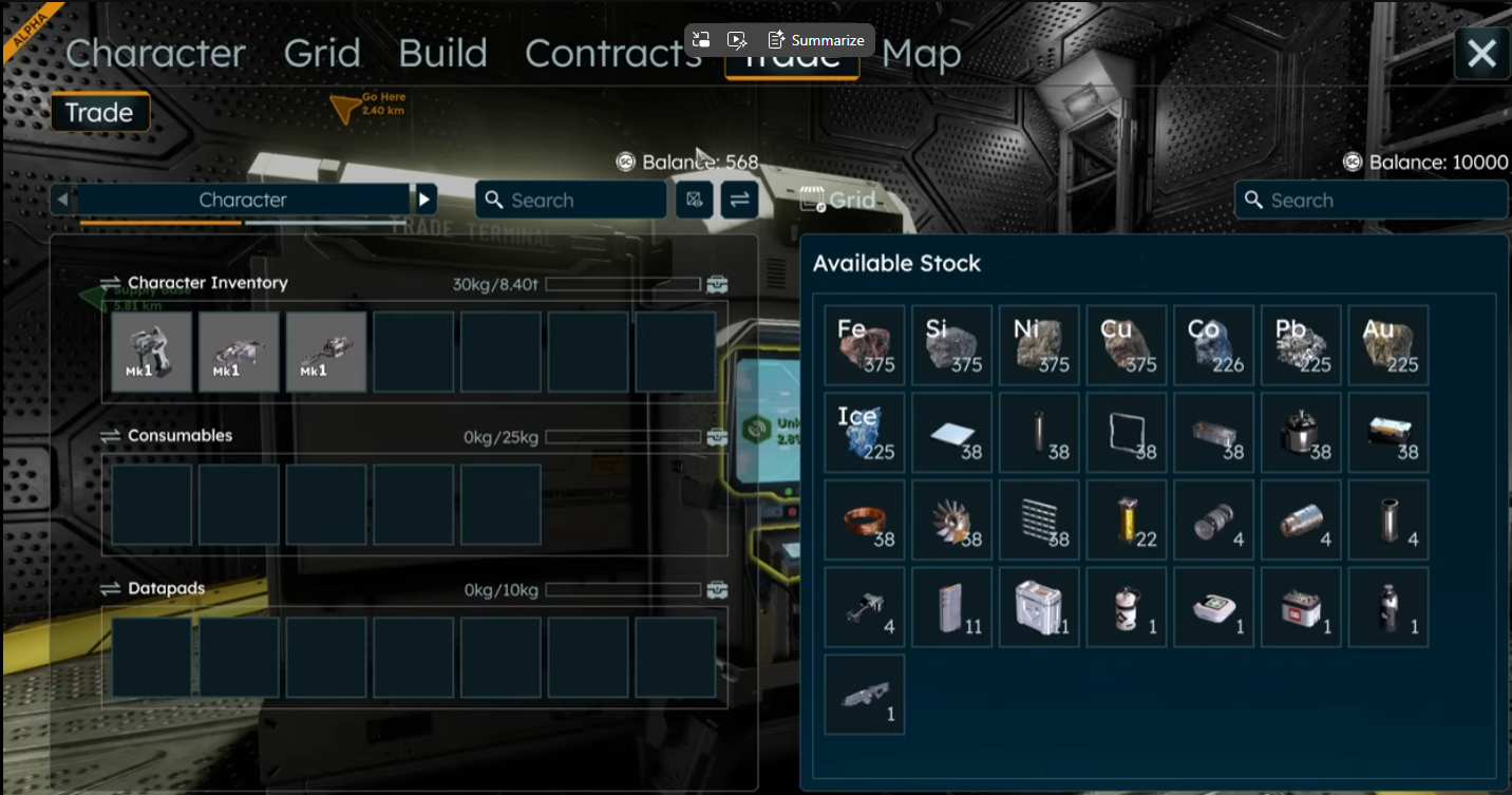
Trade UI
I really want to believe this is not the Trade UI we will receive in upcoming VS....
But release is in just few days from now and the YT video is from 2 days ago.... so...
Is it really how shop interface should look like? Seriously? Shop without prices?
Shop which buys things but does not say what kind of items, how many of them and at what price so someone need to drag item to learn if trader is interested or not?
Or maybe it buys just anything up to bank account level and this is called "economy"?
How someone even came with the design like that?
Design with popup dialog that changes size depending on the text inside so buttons change their positions?
And really, for what reason the customer can see bank account balance of the trader?
Again full screen taken but almost no key information presented and lots of empty padding?
User story:
As a player I want to open a trade interface and learn quickly without any further clicking or dragging:
- what items I can buy at this place, at which quantities and what is the offered sell price,
- what items I can sell at this place, at which quantities and what is the offered buy price
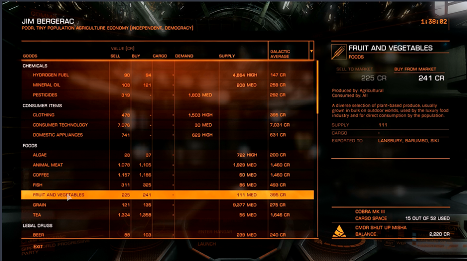
Don't reinvent the wheels, even something like ED would be 10000x better (and SE2 could and should be better than that):
 I like this feedback
lol, indeed this is how trade UI looks like... shop without the prices visible, need to drag items around to learn about price of each item :D
lol, indeed this is how trade UI looks like... shop without the prices visible, need to drag items around to learn about price of each item :D
Replies have been locked on this page!