
Terminal UI - Inventory tab: Huge headers, padding and tiny icons
Terminal UI is one of key screens in SE where players spend lots of time to manage inventory, configure and control blocks, or manage production and in my opinion is a foundation of user experience just after 3D building process.
I would expect SE2 will take into account all usability experience collected over 10+ years of SE existence and thousands of hours spent by players on this specific screen, adding more options and make inventory management much more convenient and clear.
Instead SE2 does not improve anything with inventory management over SE1.
Items still can't be sorted by name/quantity/mass/(volume), they can't be grouped by type, there is no option to change to more compact list view which would be useful for larger inventories or comparing quantities.
There is still no option to filter by item type (or quick toggles to see ores/components only) which would reduce a need for inventory sorting.
It would be also useful to be able to select multiple items and see their combined mass etc. Lots of missing UI features which I hope will be added, but as for key user interface I would expect them already delivered after so much time of game development.
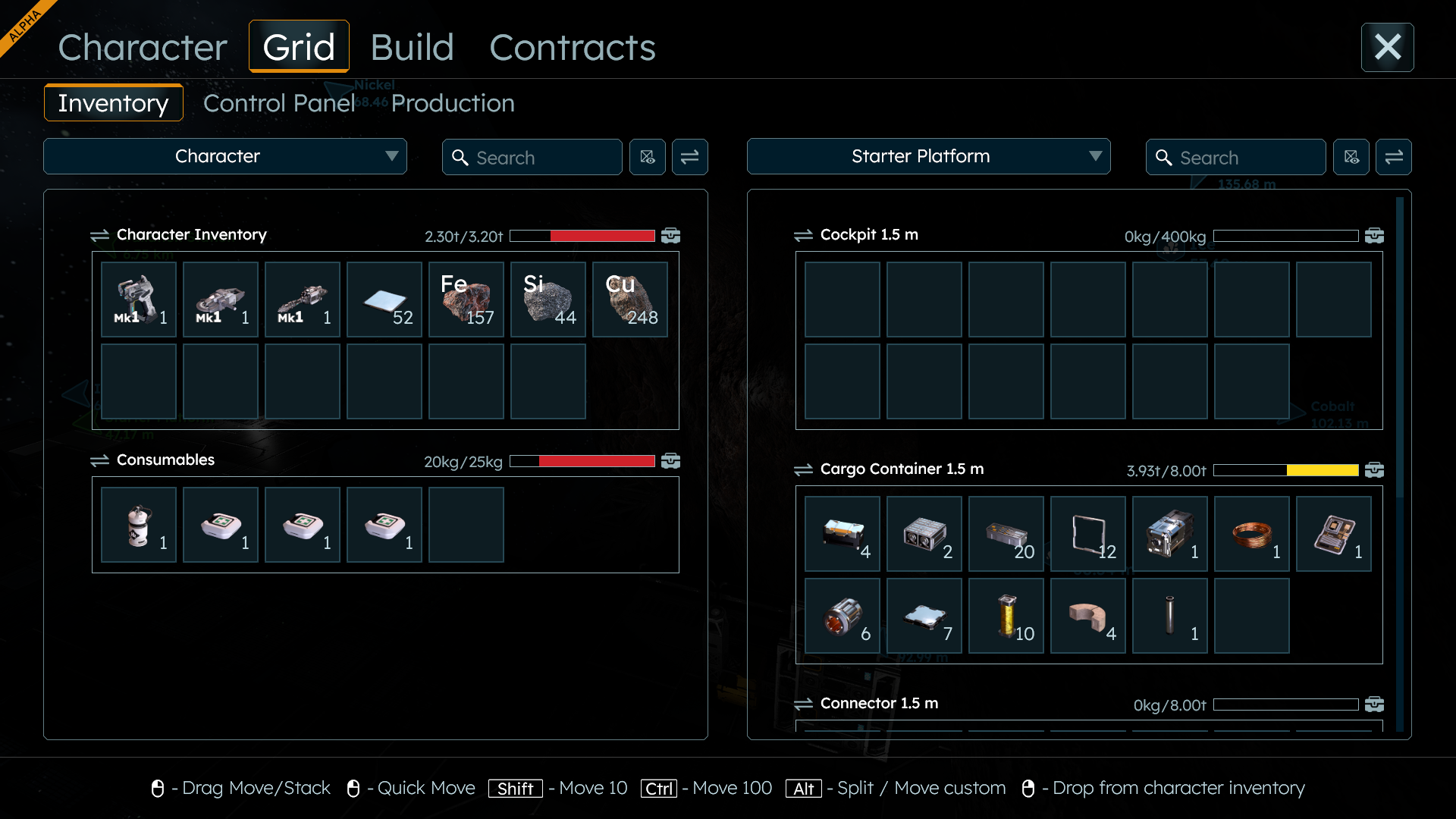
SE2 version consumes full screen but wastes a lot of space for huge headers and a lot of padding, while key information (item types, quantities and available inventory) is still pictured with tiny icons and small fonts - almost same size as on compact SE1 screen.
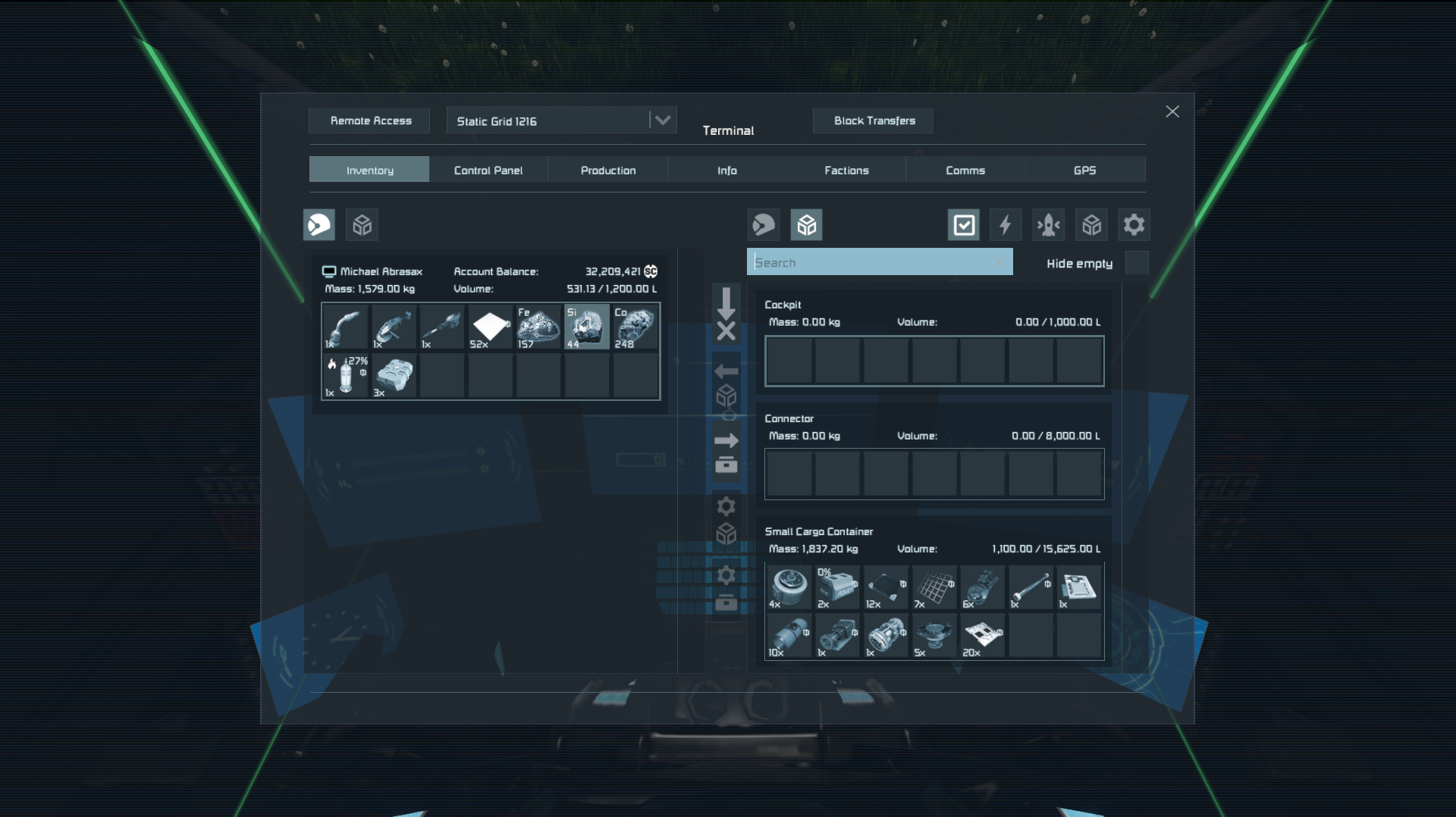
Here is a comparison side-to-side of almost identical inventory contents between SE2 and SE1 on 1920x1080 resolution full screen.
Character's inventory contains 3 tools, 4 item types and 2 consumables.
Grid contains 3 inventories - cargo container with 12 component types, empty cockpit and connector.
SE2 covers full screen but barely manages to display same amount of information with inventory slots (taking into account that "Cockpit 1.5 m" should actually collapse to just single row then one row "Connector 1.5 m" would fit).
Its style matches maybe adventure games where inventory management is a side task, but not in engineering game where lots of time is spent in inventory management or control panel settings.
SE1 is compact and leaves a lot of space around a window, but displays same number of inventory slots and even more additional controls for:
- account balance
- volume,
- 5 buttons to manage quick transfers and build planner,
- button to connect with remote grids,
- button to handle block transfers (and hidden claims of NPC grids)
- additional filter buttons (energy blocks, current grid, storage, system inventories)
which will be required in SE2 sooner or later too.
Additionally icons on SE2 are almost same size which makes them look tiny on full screen with huge headers and lots of empty space - about 72 x 72 pixels (BTW the huge X icon in top-right corner is bigger than them) while in SE1 are 62 x 62 and somehow much more readable, because they fill entire icon picture (probably because of different angle of isometric projection).
SE2 icons also do not fill entire icon area which adds even more of empty space around them, that's why they somehow look even smaller and hard to recognize.
I'm not saying SE1 version is perfect.
I'm saying SE2 did not improve anything, takes full screen but does not show more information, does not add any more control over inventory, misses key features like buttons for transfers or build planner, and additionally makes things much less readable.
 I like this feedback
There's a lot here, but for the most part I agree.
I was going to post that the icons are too small for the "slot" they take up (too much padding as described above). These items (in the Refinery for example) could be much bigger - and maybe more unique - eg Silver Rod vs Stainless Steel?
There's a lot here, but for the most part I agree.
I was going to post that the icons are too small for the "slot" they take up (too much padding as described above). These items (in the Refinery for example) could be much bigger - and maybe more unique - eg Silver Rod vs Stainless Steel?
Replies have been locked on this page!