Inventory/UI Change
I feel the way the Xbox Radial Menu's are often times confusing and way too complex, sometimes the recent blocks don't even pop up in "recently used" until a while after. We can see from other PC ports of games like "7 Days to Die", "Kerbal Space Program", "ARK: Survival Evolved" and many others had implemented a "Cursor Mode" and kept the PC Hotbar for item selection and items were selected by using either the Bumper Buttons or the Left and Right buttons on the Directional Pad. They even have button combo's for function shortcuts just like the game has now; but the inventory management and build menu I feel is way to confusing to actually want to be like "I can't wait to build another ship." instead it's more like "Oh god, I gotta build another ship.." which isn't a bad thing especially with more complex craft but it's more that the menu itself is complex and not the other way around.
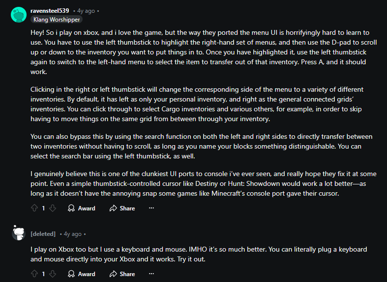
I feel this would make the Xbox Version more appealing to others, while I play on PC I have tried the Xbox version because a friend had the same issue and for the life of us we just don't see how people have functioned with it.. While the picture below is a bit out-dated there are similar posts everywhere online that end up just plugging in their Mouse and Keyboard, so making it similar to the PC version couldn't hurt.


 I like this feedback
Yes I'm on Xbox too and don't use the controller when playing SE as its too confusing, buy a Keyboard and Mouse, it works great on Xbox for SE
Yes I'm on Xbox too and don't use the controller when playing SE as its too confusing, buy a Keyboard and Mouse, it works great on Xbox for SE
Replies have been locked on this page!