


The name field in the grid list is too short
Hello, Keen. This is your most annoying player, writing again. Today I decided to write about the UI of the grid list. It has bothered me for some time.
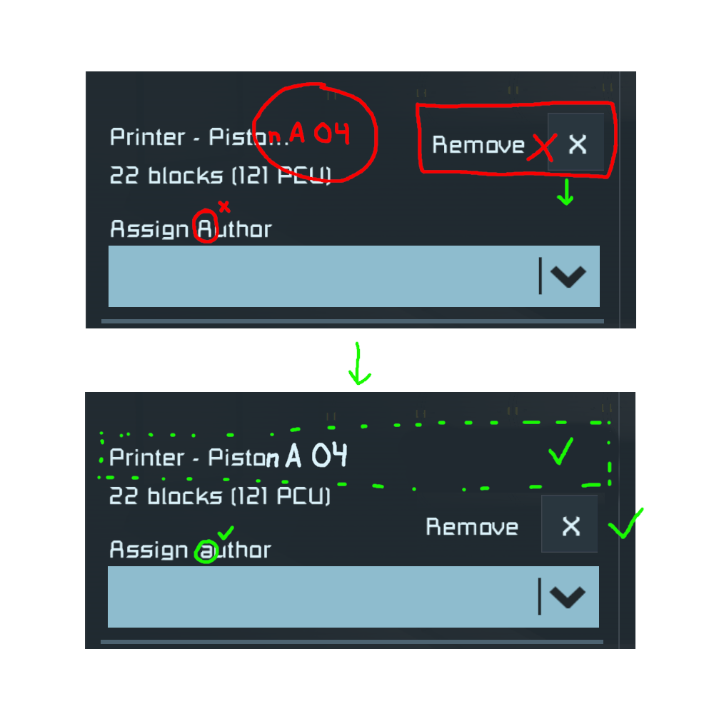
I'm a system maker, and I often use subgrids. To keep things tidy, every grid gets named by the main system, by its subsystem, and by its number, if there are many of the same type. However, if you go past 15 characters, you can't tell them apart because the name gets cut at that point. To maximize space, I would like the "Remove" button to be lowered so the name field can be extended all the way. If you don't want to do this, at least extend the name field up to the "remove" button, to maximize length within the current UI language. Since I'm complaining already, please also remove the newspaper capitalization from the "Assign Author" tag. The result of these modifications would be a more functional and visually pleasant UI section. Please consider it. Have a nice day.
 I have the same bug
 ![[2026-07-06] Sp...](https://support.keenswh.com/spaceengineers/pc/attachments/37481?token=22d78c0b6d0312274886121c1ea8d17f.png)
Replies have been locked on this page!