
This object is in archive!
UI / UX Suggestion for store discount prices
Not Enough Votes
When a price is discounted, put it in green or blue. Gamers generally associate these colors with good things.
Prices that are higher due to poor reputation with a faction should be red. Red, yellow, and orange generally indicate bad things or unavailable things.
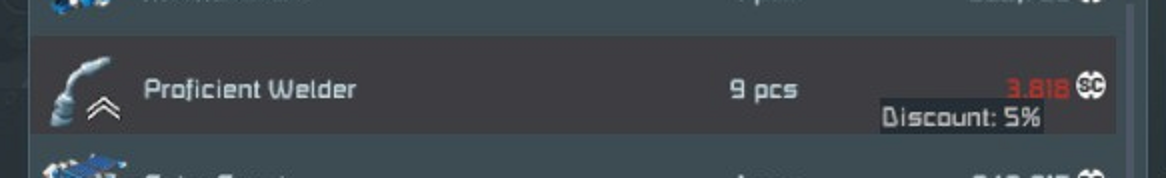
Currently discount prices are red, which is odd.
 I like this feedback
 Access denied
Not to mention that those red numbers on a darkened, reddish-grey background are insultingly difficult to read, and not just for people with color-vision deficiency.
Normal:
Red anomaly:
Red anopia:
Complete achromatopsia:
(Source: https://www.color-blindness.com/coblis-color-blindness-simulator/)
I know Keen has absolutely no sense, let alone intention to have sense, of proper UI design …
(https://support.keenswh.com/spaceengineers/pc/topic/icons-need-color-ore-icons-components-icons-ammunition-icons-give-them-some-color#comment-3099)
… but that comment is now three years old. Maybe that has changed since and it's now time to have that finally revisited?
Replies have been locked on this page!