


This object is in archive!

hud focus area
Not Enough Votes
signals or points of interests or targets, should all be able to be shown details when within the huds directional focus area. 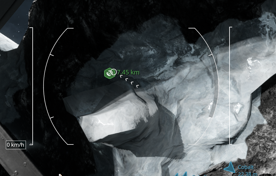 the signal should tell me what info it is giving off, as opposed to just the icon.
also we should be able to have set opacity settings for the signals within that focus zone compared to general signal opacity.
 I like this feedback
I think the HUD elements could also be reduced in size. Another issue is that even when the markers are on the sides or behind the player, they still tend to stay too close to the center of the screen. In these situations, the HUD should make better use of the screen edges to keep the center area clearer.
Also, I have seen two different icon styles that look much better and could be considered for the vanilla HUD:
Regular:
https://steamcommunity.com/sharedfiles/filedetails/?id=3617086610
Transparency:
https://steamcommunity.com/sharedfiles/filedetails/?id=3617006175
I think these improvements would make the HUD cleaner, less intrusive, and easier to read. It would be great to see something similar implemented as part of the vanilla experience.
I think the HUD elements could also be reduced in size. Another issue is that even when the markers are on the sides or behind the player, they still tend to stay too close to the center of the screen. In these situations, the HUD should make better use of the screen edges to keep the center area clearer.
Also, I have seen two different icon styles that look much better and could be considered for the vanilla HUD:
Regular:
https://steamcommunity.com/sharedfiles/filedetails/?id=3617086610
Transparency:
https://steamcommunity.com/sharedfiles/filedetails/?id=3617006175
I think these improvements would make the HUD cleaner, less intrusive, and easier to read. It would be great to see something similar implemented as part of the vanilla experience.
Replies have been locked on this page!