
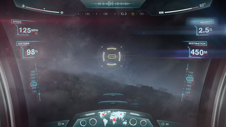
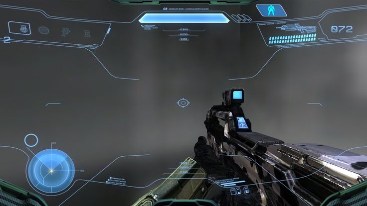
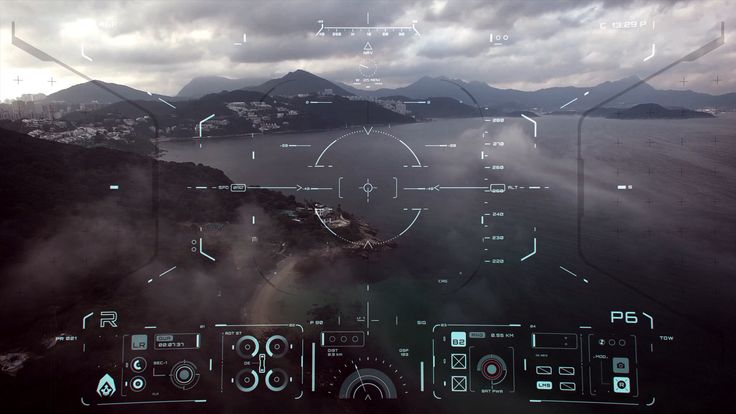
GUI & Helmet HUD
For a future update of the GUI & HUD, lets have a semi-transparent holographic HUD that is reflected on the inside of the player helmet glass.
I think this would add a sense of immersion that is really dated in SE1, plus since SE2 is not set in stone yet I have a few new modern ideas. Imagine if you were really in space you don't look through your computer screen, you look through your glass face mask.
There could be a few styles (Minimum 3?) of Helmet HUD and GUI design to choose from based on a players preference but all with the same functions. There are tons of styles out there to get inspiration from and this would be a HUGE step up from the current HUD and previous visualizations in vanilla and MODS.
- That being said, IF we had 3 choices, how about ones that make you feel like a "Miner", "Salvager", "Builder", or "PVP/PVE Fighter".
- Or even an ability in the options menu to change thew colors and glow or even rearrange the readout placements around on the HUD, like moving post-it notes around where you want them. Well, that might be a stretch of the imagination but boy would that be cool.
- Simple, Clean, Minimalistic, Futuristic, NO Dirt on the screen Please!
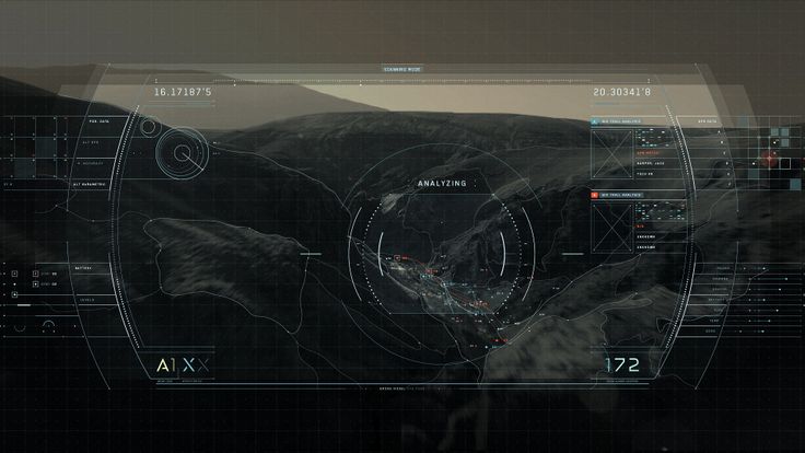
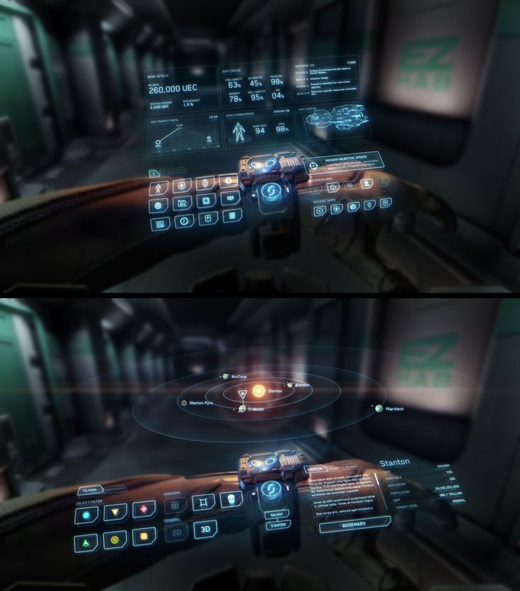
Take a look at some of the images I attached for various general concepts. Please Please Please, we need a vote on the final esthetic, we are gonna be looking at it every time we play.

 I like this feedback
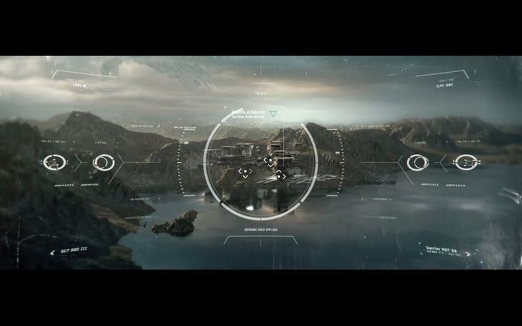
Imagine looking out from your helmet.
Imagine looking out from your helmet.
I second this request as I ALWAYS use the MOD Helmet with reflective glass in SE, it really helps the immersion! See attached
I second this request as I ALWAYS use the MOD Helmet with reflective glass in SE, it really helps the immersion! See attached
No need to overload the interface with bells and whistles. The UI in SE1 was normal. In my opinion, it was not colorful enough (all the ores and blocks were visually mixed). This is the only significant complaint.
No need to overload the interface with bells and whistles. The UI in SE1 was normal. In my opinion, it was not colorful enough (all the ores and blocks were visually mixed). This is the only significant complaint.
Could have several different craftable helmet models each with a different HUD theme. I know it's not the focus of the game but some variety in the personal equipment area couldn't be unwelcome.
Could have several different craftable helmet models each with a different HUD theme. I know it's not the focus of the game but some variety in the personal equipment area couldn't be unwelcome.
Dorian Compo probably wants his artwork back but the idea is a good one. The interface in SE 1 is very plain/old looking and SE 2 deserves something more refined indeed.
Dorian Compo probably wants his artwork back but the idea is a good one. The interface in SE 1 is very plain/old looking and SE 2 deserves something more refined indeed.
Replies have been locked on this page!