
Public Test UI Feedback 1.194
Submitted
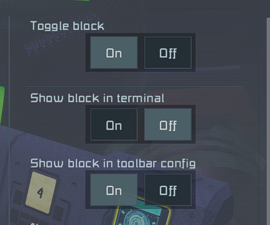
The bright blue of the text bars and buttons are way too bright comparted to the rest of the UI, and the boxes around the block options look odd, and the buttons there look way too bright as well, like the text boxes. I do like some of the changes but these are the things I found out of place.
 I like this feedback
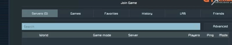
the bright blue on the text bar looks far too bright, either that or the text is far too bright and needs to be darker
the bright blue on the text bar looks far too bright, either that or the text is far too bright and needs to be darker
Replies have been locked on this page!