
Japanese Font Improvement Request: Replace Microsoft JhengHei with a Standard Japanese Font
Hello Keen Software House Team,
Thank you for adding localization resources for Japanese in Space Engineers. Although Japanese is not officially supported, the existing resource files allow for nearly complete Japanese display, which is greatly appreciated by the Japanese community.
However, we have identified a significant issue regarding the font used for displaying the Japanese text:
1. The Issue: Incorrect Japanese Glyphs
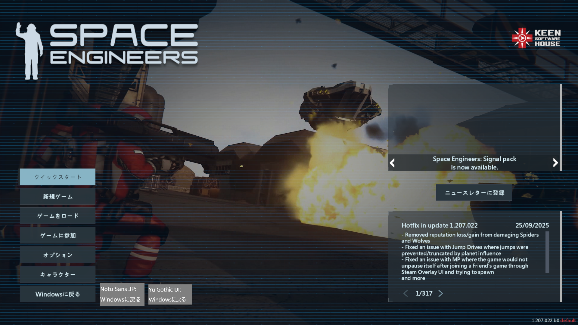
The current Japanese text uses the Microsoft JhengHei font.
Microsoft JhengHei is a font designed for Traditional Chinese (Taiwan).
This causes the display of Japanese kanji (e.g., in the UI, chat, or terminals) to use the incorrect Chinese glyphs (character shapes) instead of the standard Japanese glyphs (JIS/Shinjitai).
Example: The character "戻" (modoru / return) is displayed with a shape that is unfamiliar and incorrect to Japanese readers, making the text unnatural and less readable.
2. Proposed Solution
To resolve this issue and significantly improve the quality of Japanese localization, we kindly request that you consider changing the font used for Japanese text to a proper Japanese typeface.
We suggest the following font, which is open-source and widely used in Japanese environments:
Noto Sans JP
Open Source / Japanese Standard
Highly Recommended: It is open-source (SIL OFL), includes correct Japanese glyphs (Shinjitai), and is often used as a standard for CJK (Chinese, Japanese, Korean) compatibility, minimizing character display errors.
Yu Gothic UI
Windows 10/11 System UI Font
A modern, high-quality font included as the standard UI font in recent Windows versions, guaranteeing correct Japanese character shapes.
Using a genuine Japanese font like Noto Sans JP will ensure correct character shapes, making the game text look professional and significantly enhancing the immersion and experience for all Japanese players.
The constant use of incorrect glyphs creates a fatal error in user perception. For a native Japanese speaker, seeing a Chinese glyph in place of a standard Japanese kanji is akin to telling a native English speaker that the Latin letter 'a' and the Greek letter 'α' (Alpha) are interchangeable. While the text is technically readable, the cognitive dissonance is constant and severely impacts the quality and trustworthiness of the entire game interface.
Thank you for your time and consideration of this important localization improvement.
 I like this feedback
Another common example is the character "直" (choku/nao/straight). In the Chinese font, the structure of this character's final strokes differs significantly from the standard Japanese glyph, further contributing to cognitive dissonance for Japanese users.
Another common example is the character "直" (choku/nao/straight). In the Chinese font, the structure of this character's final strokes differs significantly from the standard Japanese glyph, further contributing to cognitive dissonance for Japanese users.
Furthermore, the font choice incorrectly applies Chinese typesetting rules to Japanese text. In standard Japanese typography (based on JIS and JLREQ rules), punctuation marks such as the full stop (。) and comma (、) should be placed in the lower-right corner of the full-width character box. However, the current font (Microsoft JhengHei) places them centered in the box, which is the rule for Chinese. This issue further breaks the reading rhythm and professional appearance of the localized Japanese text.
Furthermore, the font choice incorrectly applies Chinese typesetting rules to Japanese text. In standard Japanese typography (based on JIS and JLREQ rules), punctuation marks such as the full stop (。) and comma (、) should be placed in the lower-right corner of the full-width character box. However, the current font (Microsoft JhengHei) places them centered in the box, which is the rule for Chinese. This issue further breaks the reading rhythm and professional appearance of the localized Japanese text.
Replies have been locked on this page!