
Progression interface could be Improved greatly
Submitted
When I do a research in the progression tab, the result item get slightly dark green, Please make that more contrasting more highlighted, it's very hard to see, look at image "current search result.
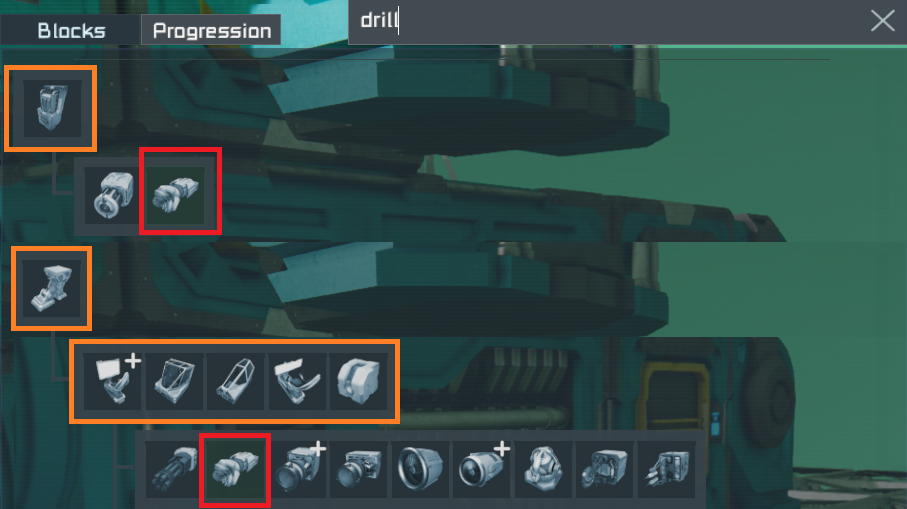
The search in that tab should hide(shrink) any branch that does not contain the researched block, look at image "What we should see".
In many video I saw of the past 3 test, peoples miss often the fact they can unlock a block with more than 1 path and most people don't even see the "highlighted" dark green in the list.
 I like this feedback
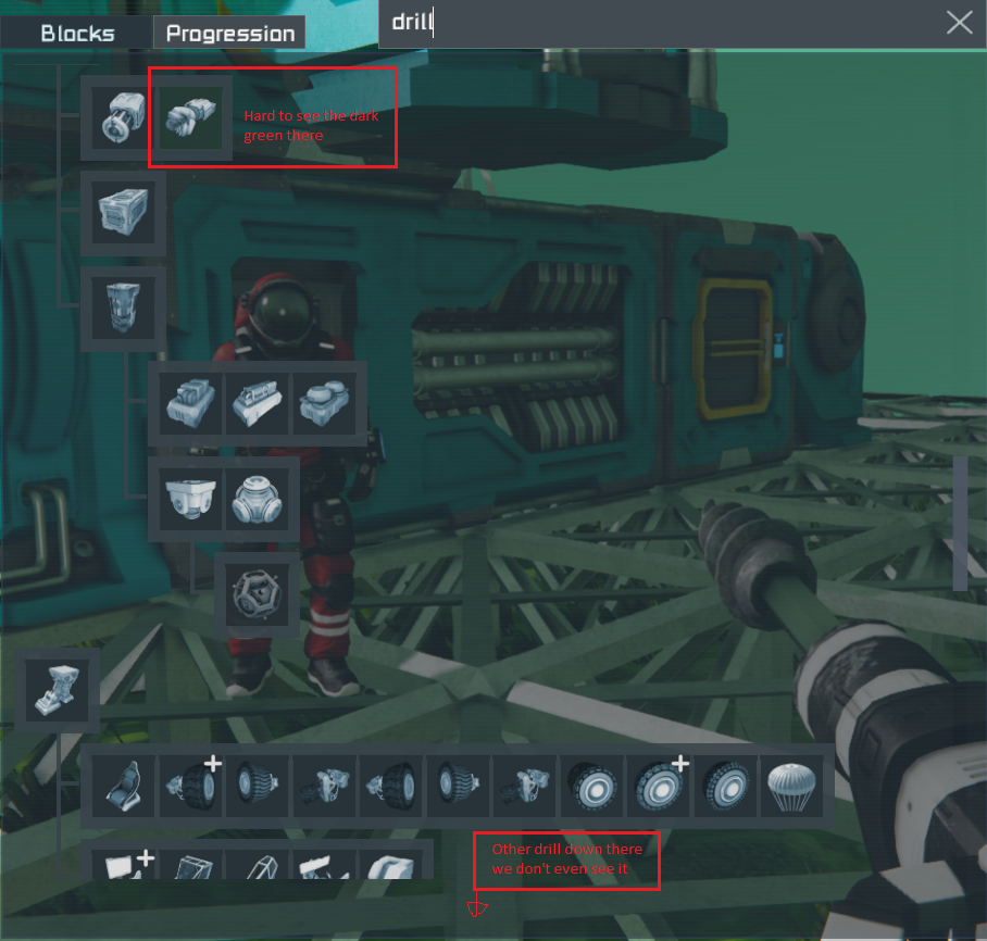
Access denied
Replies have been locked on this page!