
Space Engineers 2 UI clutter and maybe a little tip?
Hi team of space 2. let me start with that i am a very big fan of space engineers and i just loveee the game and how it plays (but yall hear that enough i think so let me get straight to the point). so i have just recently bought space 2 and the game is great, the grapichs, collisions and just the overall feel but something botters me alot, the ui clutter. i find the ui so masively cluttering its like i am playing a text game sometimes and it just doesnt feel right to me, i also have this with space 1 and it just annoys me sometimes. and yes you could just say press dubble TAB and its gone (and so are is the infromation i acctualy need). in space 2 it annoys me the most when looking at a block i am trying to build. the ui just completely envolps my screen. this is no hate just an idea!! maybe just make it so that when looking at a block the UI is attacht to the block if you get what i mean. and also the objectives on the top left maybe just remove it and let the player see it when he starts the mission/objective. i attacht a picture but as you can see its just right in youre face and its not small. i love the game and i hope you guys the best with creating another masterpiece like space 1!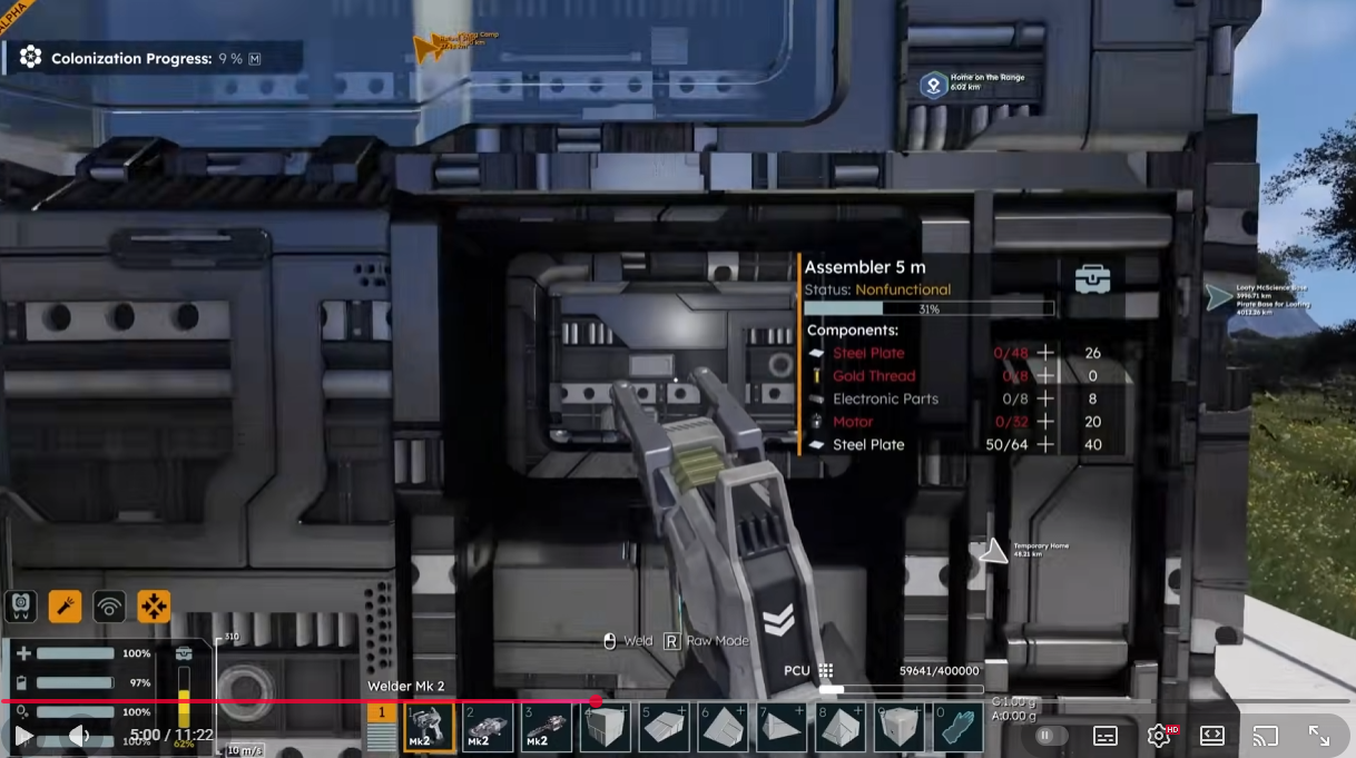
 I like this feedback
Replies have been locked on this page!