
Make Likes in topic pages more clear
Submitted
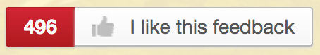
Currently when you have a topic open the like button will read "I Like this feedback" regardless of if you have liked it or not, and more confusing is the fact that the thumbs up to the left of it is counter-intuitive with it being grey when liked and green when unliked, the exact opposite of what one would expect.
My suggestion
- have it be grey when unliked and read "like this feedback?"
- have it be green when liked and read "I like this feedback"
This will fix the problem with the confusing colours while needing no new assets and have little to no effects on webpage alignments as both phrases are about the same size as you should be able to see above so don't need to worry about it breaking the page layout.
 I like this feedback
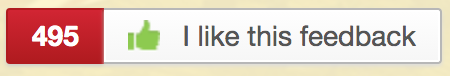
Replies have been locked on this page!